
Sharper KPIs, richer benchmarks, and numbers you can finally compare
This release makes it easier to read your KPIs the way you actually think about them. You can now choose how each KPI is displayed, see a full year of benchmark data in one view, and put different satisfaction scales side by side.
For CX teams, that means fewer detours through spreadsheets and faster, more confident reporting.
The reporting friction you didn't choose
Reporting on customer feedback often means fighting the format you're given. A KPI that would be clearer as a chart is stuck as a number, or the other way around.
Comparing performance across a full year means clicking through page after page. And when one survey runs on a 1-10 scale and another on 1-5, lining them up for a stakeholder review takes manual math nobody has time for.
None of these are big problems on their own. But they add friction to every report, every week.
What's new in this release
Pick how every KPI looks
What it does
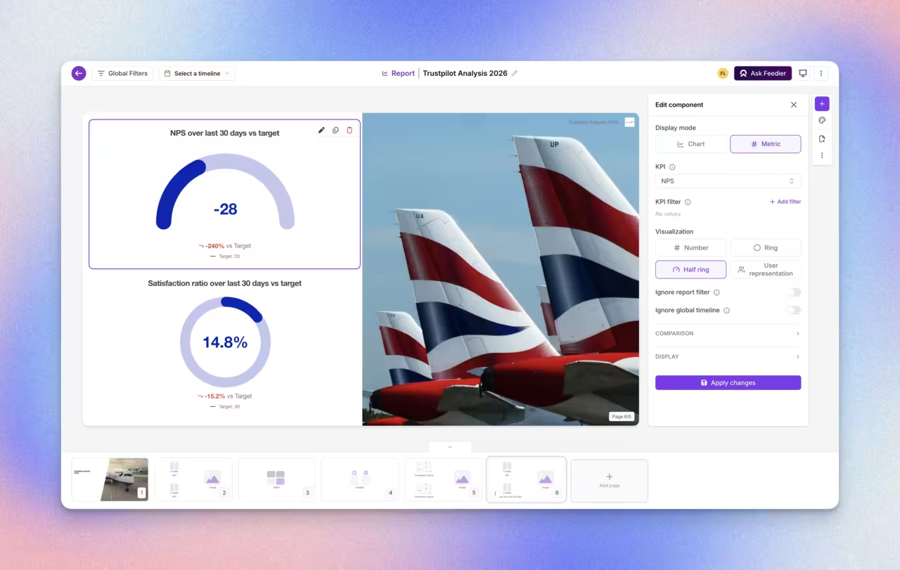
KPI components now have a visualization selector, so the same KPI can be presented more than one way. Two new satisfaction displays are available for any satisfaction KPI — not just NPS, but CES and ratings too — plus a new item chart on the Operational KPI. The selector only shows the visualizations that actually fit the KPI you picked.
Why it matters
Different audiences read numbers differently. A chart makes a trend obvious in a dashboard review; a single metric makes an executive summary land faster. Now you choose the display that fits the moment, instead of building around whatever the KPI defaults to.
Where this helps
- Show a trend as a curve in a team dashboard, then switch to a metric for an exec deck
- Give CES and rating KPIs the same visual treatment as NPS
- Adapt Operational KPI reporting to match how your team already reads data
This means you can present the same KPI the way each audience understands it best, without rebuilding the report.
See a full year of benchmarks in one view
What it does
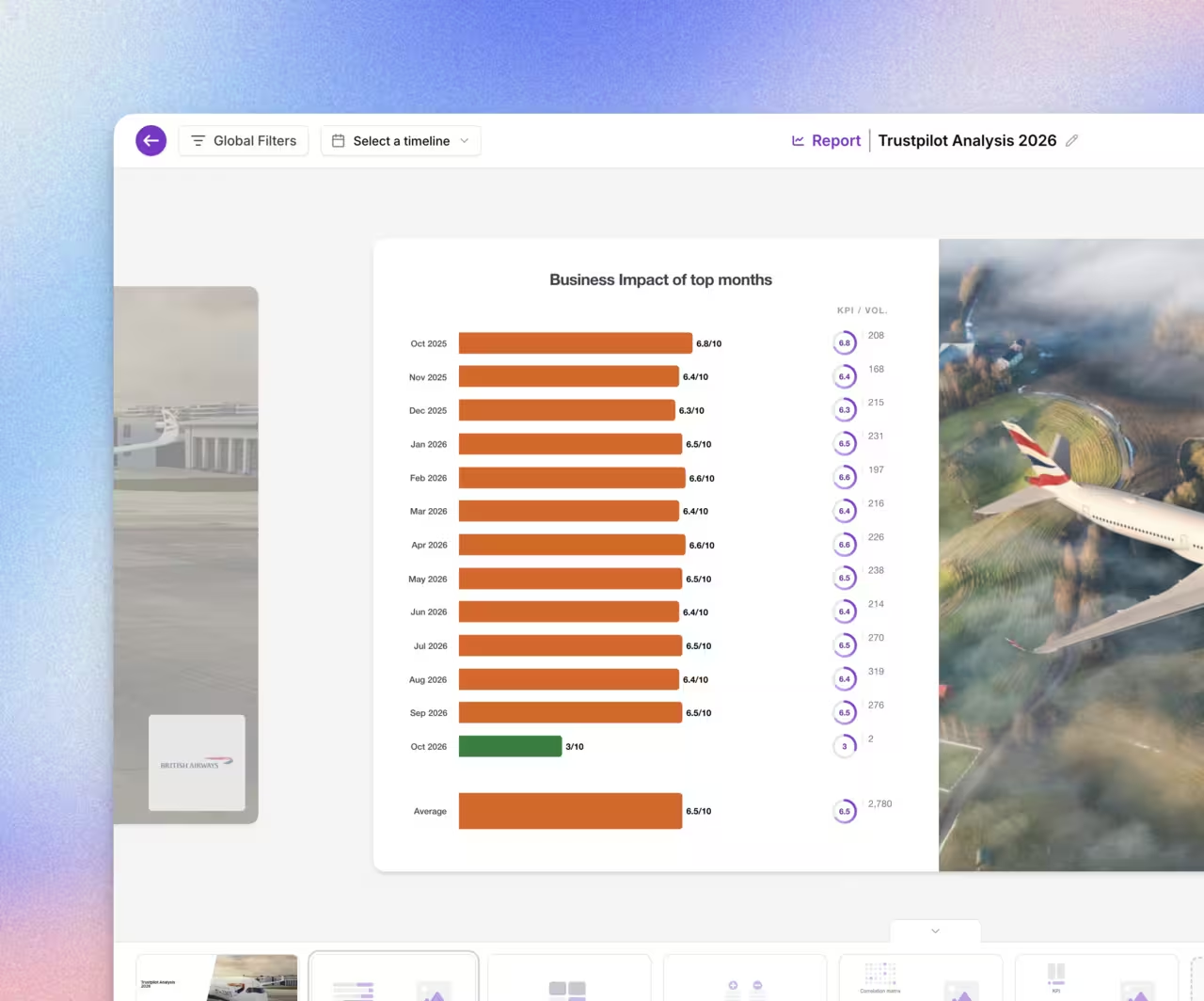
Benchmark in Reports gets four upgrades: an average curve in line chart mode, sorting by your own custom KPI, a full 12-month view on a single page, and control over the order choices appear in.
Why it matters
Year-long comparisons are where trends actually show up, but only if you can see them without clicking through months one at a time. Sorting by a custom KPI means the benchmark reflects the metric your team actually tracks, not just the default.
Where this helps
- Review a full year of performance on one page, using any 12-month range
- Sort a benchmark by a custom formula to match what leadership cares about
- Order choices by template order, volume, or a custom drag-and-drop sequence
- Track the average trend as a line instead of reading it off a bar chart
This means you can spot a full year of patterns in one view instead of stitching monthly reports together.
Compare KPIs on the same scale
What it does
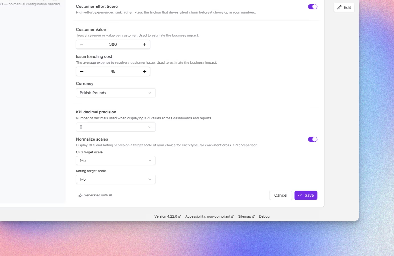
Business Context now controls decimal precision for KPI numbers (0, 1, or 2 decimals) and can normalize CES and rating scales to a common footing — 1 to 5 or 1 to 10.
Why it matters
A CES scored out of 7 and a rating out of 10 look comparable, but they aren't, until someone does the math. Normalization removes that step, so KPIs built on different scales can sit side by side and mean the same thing.
Where this helps
- Compare CES and rating KPIs from different surveys without manual conversion
- Standardize decimal precision across every report that references the same KPI
- Build an executive dashboard that mixes scales without a footnote explaining why
This means you can put any two satisfaction KPIs side by side and trust the comparison.
How to access it
These updates are live in your Report Builder today. Open any KPI component to pick a new visualization, adjust decimal precision from Business Context, and turn on scale normalization to compare CES and rating KPIs directly.
What this release changes for you
Your KPIs now display the way your audience needs them to, not just the way they default. Your benchmarks tell the full-year story in a single view instead of twelve. And your scores are finally apples-to-apples, so a stakeholder review doesn't start with a scale conversion.
Reporting gets faster. The story you tell gets clearer.
Level 4? You're Level 2
Get the Five Levels of Voice of Customer Maturity

Our articles for further exploration
A selection of resources to inform your CX decisions and share the approaches we develop with our clients.